Thursday, March 29, 2012

Flawless

"Art is beauty, the perpetual invention of detail, the choice of words, the exquisite care of execution. " -- Theophile Gautier

When designing it can be difficult to get the project to look just right. It takes a great attention to detail, loads of dedication, and ample amounts of time. This week, I came across a few photos that were edited (or recreated) flawlessly in Photoshop. These images have inspired me to work harder to create something as seamless and to execute something as perfect as the projects these artists have put together.

 The first image I found features an orange frog that becomes a peeled orange (fruit) in the center. The editing is so well done that the viewer cannot see where the combination of the two photos exists. This project makes me wonder how I could apply this technique to other objects. I have found that I start imagining what it would look like to cut other things in half and add something in the center to hold it together. This project is beyond clever, because the frog already looks like an orange, so literally adding an orange peel in the center almost makes sense. I am not sure if I would ever be able to think of something quite this clever, but this photo definitely makes me wonder and ask a lot of "what if" questions.

Another image I found combines a sketch and a background photo so seamlessly, that it is almost impossible to tell it has been edited. There were many photos like this one, but this one was my favorite. All of the photos that Ben Heine produces are perfectly aligned. The hand and the sketch were added in later, but in most cases you cannot tell. This is such a cool idea! I find that it inspires me to want to think more creatively about what I add to my photography. I never would have thought to add a picture or sketch that fits perfectly into a picture. The flawlessness of this project is what really makes it work. This project makes me wish I spent more time perfecting every project that I put my name on. It also really makes me want to think outside the box more and start combining different elements of art into one project.
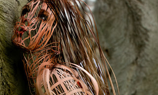
The last project that I found this week involved photography and 3D wire sculptures. The final project is pretty amazing. This is definitely the most unique project that I cam across this week. The artist had to put a lot of work into this project, which inspires me to keep working hard so that one day I can create something as unique and interesting as this piece. The idea alone is magnificent, but the execution of the final product makes this project really something to be admired. All of these photos show the dedication to detail that the artists have. Flawless execution requires a lot of hard work, and after this week I hope to start implementing more of these elements into my designs.

Thursday, March 22, 2012

Simplicity

 "Making the simple complicated is commonplace; making the complicated simple, awesomely simple, that's creativity." --Charles Mingus

One of the hardest things to accomplish as a graphic designer is to find the  compromise between simplistic and simplicity. As the graphic here shows, simplicity is about being aware of your design and knowing what is most effective and what is unnecessary; where as simplistic is more of a lack of effort or wit. Too often, designers try too hard to come up with complex, fantastic ideas. However, a lot of the time designs that have the right element of simplicity are most effective. Hans Hofmann once said, "The ability to simplify means to eliminate the unnecessary so that the necessary may speak." 

There have been rumors that major companies are gravitating towards minimalist branding. Good Design Daily had an article on their website that showed what packaging designs may look like in the future. Here are some examples: 

Red Bull can becomes progressively minimalistic.

The Nutella jar undergoes the same kind of change.
On a different site, I found the Pepsi logo timeline. The Pepsi logo has also become minimalistic.

I believe that these minimalist takes on branding can be very effective. Some may think they are too simple or plain, but I think they become more obvious or apparent on a shelf with other products that have complex or intricate packaging. Leonardo da Vinci said, "Simplicity is the ultimate sophistication." I believe this reigns true for these designs and the idea of simplicity in design. However, if this trend catches on and spreads like wildfire, the simplicity may not be as effective because it will be the norm. The unique quality that it holds now definitely helps the cause. Some businesses are using simplicity not only in their branding, but also in their advertisements. Take a look at this ad for a hat business:
This ad shows that a hat can make all the difference between looking like Adolf Hitler or Charlie Chaplin.
This ad is very minimalistic, yet it is so creative and clever. There is no need for a lot of text or explanation. The design speaks for itself. This design is what I hope to someday be able to accomplish. Eliminating unneeded parts of a design is often difficult because I have tunnel vision at times, but it is an important to skill to attain because it is often more effective. Another example of simplicity in a different context is the Hunger Games movie poster. I thought I'd include it in honor of it's premier tonight. There is not a lot going on in the poster. It is simply a picture of the main character, Katniss Everdeen. However, the darkness that consumes most of the poster and the lighting on her face speaks volumes about the story. It is not a happy, feel-good kind of story. It's dark and haunting. This poster fits the movie so well. The designer could have easily placed a battle-like scene on the poster to show the violence that exists in the movie. However, I do not believe that would have been as effective. The simplicity of the this design makes it extremely effective.


In the end, simplicity can often have more complex thoughts behind the design than an extremely intricate design. Accomplishing simplicity is not about being lazy or taking the easy route. It is about leaving only the most effective parts of a design to portray your message.

Thursday, March 15, 2012

Graphic Design

It seems like just yesterday I decided to take on graphic design as my major. Second semester of freshman year was when I began to discover my love of the field. Sophomore year, I committed to the major. It was the third major I had switched to, but I knew it was the only one I would stick with. I'm sure before I know it I'll be graduated from Waynesburg and out in the real world searching for a job. It can be kind of intimidating to think of competing for internships and jobs. There are a lot of graphic artists who do amazing work. As I was looking at some projects that graphic designers around the world had published, I stumbled upon a website that gives hope to those of us who are just starting out. Here is the link. The site is called #50 Things Every Creative Should Know. It gives advice like: You are not the first, There will always be someone better, Share your ideas, and Take responsibility for failure. Each piece of advice has a title, an illustration, and a small description that can be easily tweeted. This advice was very encouraging and somewhat inspiring to me. Obviously, I am not the first graphic design student to look for an internship, but actually thinking about it made me relax. More people than I can count have gotten internships. This means it is possible. The same will go for the job market once I graduate. Like I said before, it is also intimidating to see others work at times. The advice that the site gives about there always being someone better was also encouraging to me. It is pointless to waste time worrying about the work that other people do. I need to do my best. That is all that really matters.

Although it is not good to dwell on how seemingly perfect other designers work can be, I often feel inspired by the work that others do. This especially applies to logo designs. I love creating logo designs, and as I was meandering around the web this week I found a website that showcased a few really cool logo designs. I absolutely adore logos that feature a play on words. I find them to be extremely clever, and I often dream of being able to create such a perfect design. Here are some examples of what I am talking about: 


Ed's Electric features an electrical plug that forms an 'E' in the negative space.


The Pink Umbrella logo illustrates the letter 'U' into the handle of the pink umbrella.


The Go Music logo transforms the word go into a guitar.


These logos are so simplistic, yet so brilliant. They inspire me to think outside the box when creating logos. They are so obvious, yet so unique because the designer chose to incorporate the theme of the logo in a creative way that you don't see too often. Right after I found these logos, I found a tool on a website that helps designers find variations of every color imaginable. The user only needs to click on one of the colored squares on the main page. Once a color is selected, the site shows every variation of that color. It has a copy button once you select a variation so that you can paste the color code into whatever program you are designing with. This tool is very exciting to me because often when I'm designing logos, I can't seem to find the exact color that I want. Here is the link


Overall, after browsing through some graphic design articles, blogs, and websites this week I have learned that what is most important is working hard and doing my best. The best part is , I'm not along. There are infinite amounts of resources out there to help me along the way. The color variation tool is something I am sure I will use a lot in my designs. Looking at others creativity can boost my own. And finally, reading advice from design veterans will guide me along the way.